Grow up – glow up!
The Prototype Fund is growing up: Class 01 of our redesigned funding program will start in June, heralding a new phase for the Prototype Fund. As previously announced, this will also involve a rebranding of the Prototype Fund, and we are proud to present the first results.
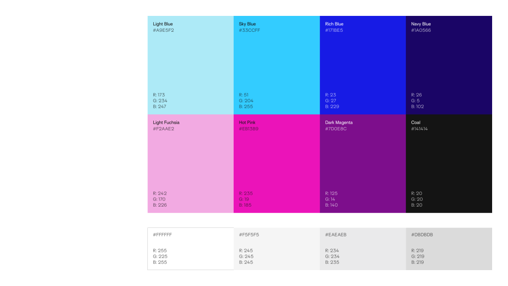
In addition to working hard on a new website, we have been in the process of giving the Prototype Fund a visual makeover for some time now. The idea of achieving this with more subtle colors has been developed into a whole color palette in collaboration with the team at VillageOne, which gives us flexible options for combining colors while still maintaining a look that is unmistakably Prototype Fund:
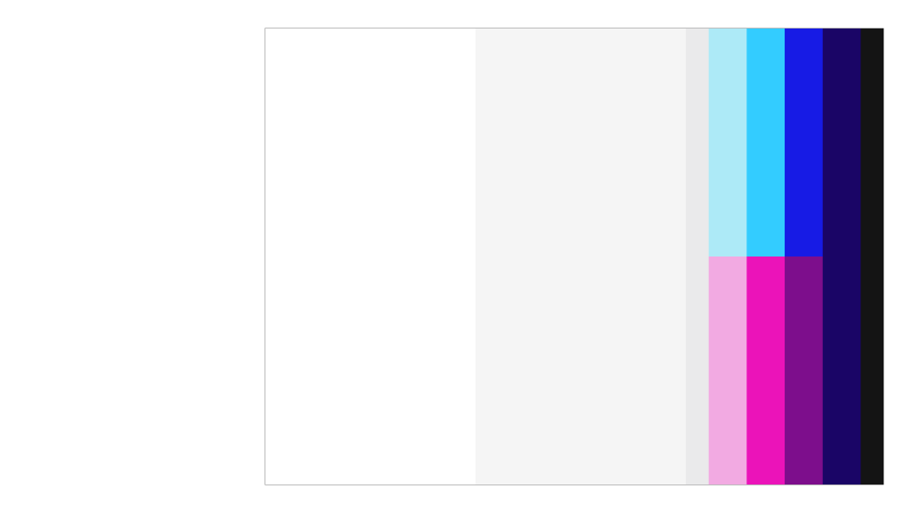
However, this also takes us a step further into the “color spectrum”: Until now, our visual identity has been very clean, uncluttered, and dominated by lots of white space, only occasionally broken up by pink or blue. Because we want to convey visually that although some changes are being made, much will remain the same, we have opted for a very tidy layout in which we continue to give plenty of space to white and gray tones:
With new colors, it was also clear that our old logo needed to be refreshed. We tried out lots of different ideas, thought long and hard, and looked at countless creative designs – but in the end, we came to the conclusion that the new version of the Prototype Fund is not a revolution, but an evolution. We already really like many aspects of our funding program, even though we have, of course, made some improvements. This is also reflected in our new logo, in which our lettering has literally grown in size:
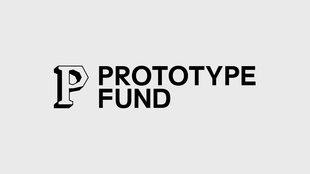
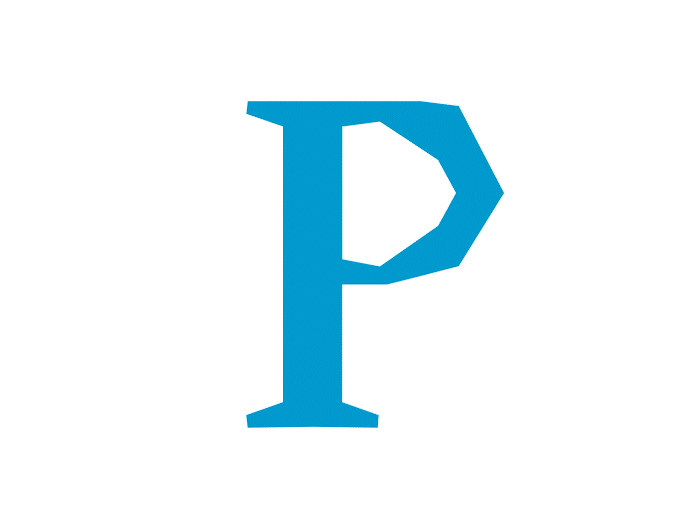
Our iconic P remains almost unchanged – but instead of the old pink and blue colors, it now features a simpler black and white design with a 3D effect, decorating our website, social media profiles, and print products.
In line with this, we have also decided to stick with our beloved font Surt. At the same time, we wanted to loosen up the typeface a little and are therefore happy to welcome the open-source font Inclusive Sans to our font family – taking us one step further towards open design.
You can already see how it all fits together on our staging website staging.prototypefund.de with the password “pushpull.” New features and designs are being implemented there on an ongoing basis. However, much is still “work in progress” and, of course, a lot of content is still missing.
We look forward to the next steps!